
Wednesday, May 28, 2008
Housing Crisis
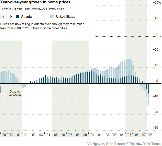 This interactive graph will allow you to compare home prices across the nation for the last 20 years.
Click HERE for an interactive housing vacancy rate map.
CURRENT RENT RATIO: The purchase price of a typical house divided by the annual rent of that house. Click HERE for a national map of selected cities.

![]()
Subscribe to Posts [Atom]