
Wednesday, January 24, 2007
Yearly US Budget Deficit or Surplus, 1961-2006
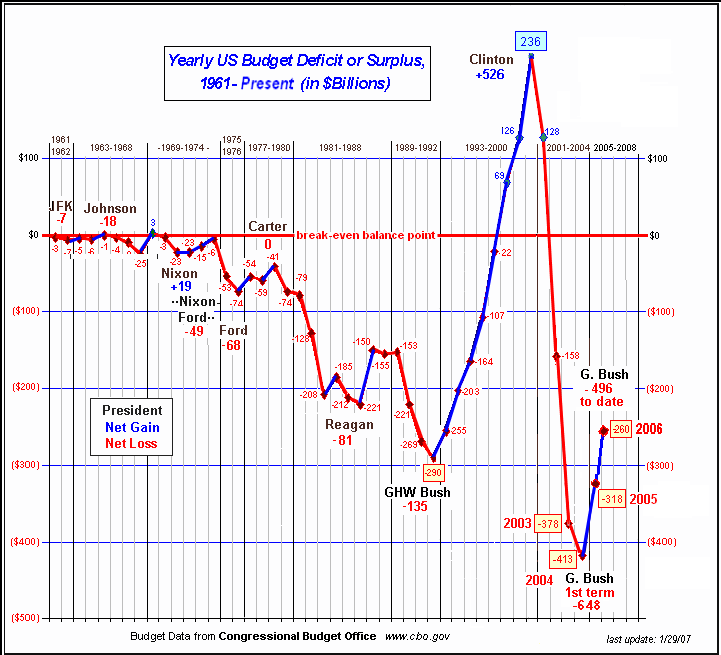
This graph shows the relationship between Presidential administrations and the yearly budget deficit or surplus for 1961 through 2006.
Click the thumbnail above to see a larget version.
Health of Children in Red States Suffers
Click the thumbnail above to see a larget version.
Health of Children in Red States Suffers
Labels: budget deficit, budget surplus
Comments:
<< Home
I created this chart from the CBO data.
The URL has changed.
The updated chart 9 with the new 2008 projections, is now at
http://www.peacemap.us/deficit.gif
JB
Post a Comment
The URL has changed.
The updated chart 9 with the new 2008 projections, is now at
http://www.peacemap.us/deficit.gif
JB

Subscribe to Post Comments [Atom]
<< Home

![]()
Subscribe to Posts [Atom]