
Saturday, March 03, 2007
Civilian Employment-Population Ratio
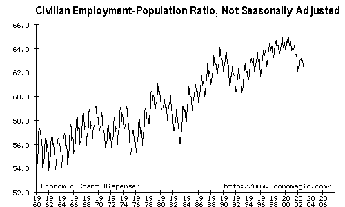 This graph is not seasonally adjusted. One can see the influence of each season on the employment rate. The bigger upwards trends indicate more of the population is employed each year--or perhaps people are having fewer children so that working adults are a larger part of the population. Or perhaps more adults want or have to work. The graph shows data from 1964 through 2006.

![]()
Subscribe to Posts [Atom]