
Tuesday, May 08, 2007
Health Care Costs
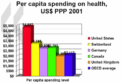
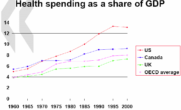
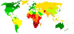
These three graphs show, left to right, respectively, Per Capita Spending on Health Care in 2001, for several first world democratic countries, Health Spending as a Share of GDP, and Life Expectancy by Country.


![]()
Subscribe to Posts [Atom]